
UPDATE (please see below for a UK graph)
If you ever believed that the inequality levels we’re seeing today in most so-called developed economies are inevitable, not so very remarkable, and not as extreme as some might have us believe, economists Thomas Piketty, Emmanuel Saez and Gabriel Zucman have produced a graph that demonstrates the problem, well, rather graphically in the New York Times.
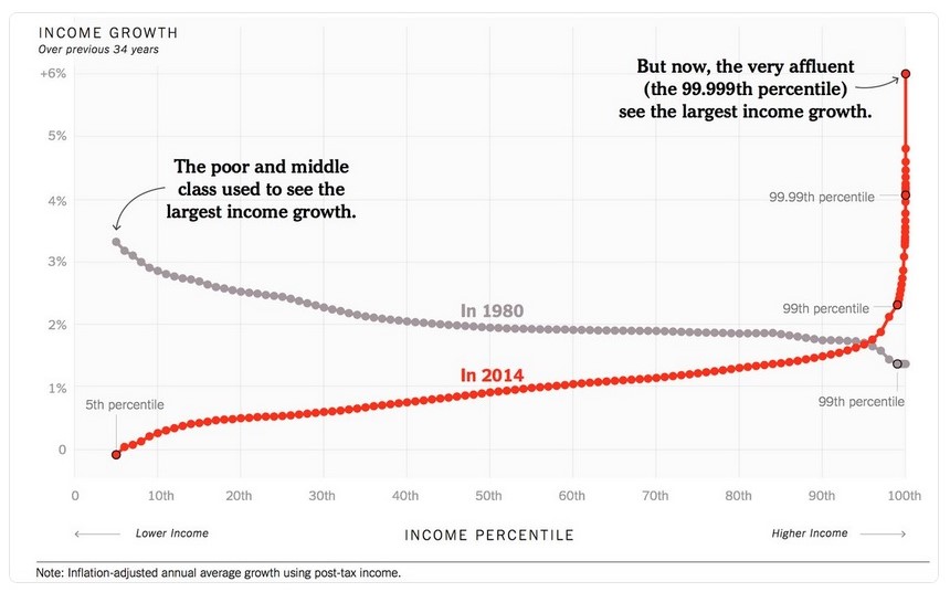
source: Gabriel Zucman
It doesn’t take a genius to see that something has gone very badly wrong. In the language that those at the top of the tree in a country like the United States so often like to use, there are winners, and there are losers here. And the losers in fact, are pretty much all of us. The winners? A tiny, tiny proportion of the population.
And this was by no means inevitable. It was a result of policy decisions based on either a willful misunderstanding of economics, or perhaps politicians from the 1980s onwards really don’t understand what happens to economies when you systematically implement measures that use rising productivity to distribute wealth and economic gains upwards and strip back the income increases that, until that point, ordinary families were getting.
As the article says,
“The basic problem is that most families used to receive something approaching their fair share of economic growth, and they don’t anymore.”
And quite rightly, it points out,
“Different policies could produce a different outcome. My list would start with a tax code that does less to favor the affluent, a better-functioning education system, more bargaining power for workers and less tolerance for corporate consolidation.”
At the core of the “supply side” revolution that Margaret Thatcher and Ronald Reagan pushed through in the 1980s was a simple idea propagated by Arthur Laffer: cut taxes on rich people and powerful companies and they will boost economic growth to the point that tax revenues will actually rise. Like many simple and beguiling ideas, this was simply wrong. It never happened. But politicians the world over were seduced by this lazy thinking, and the lobbyists of the rich had a field day.
Not only have the tiny proportion of super-rich gained disproportionately, but they’re also the group of people least likely to be paying their fair share of taxes. So, us ‘losers’ are getting hit twice.
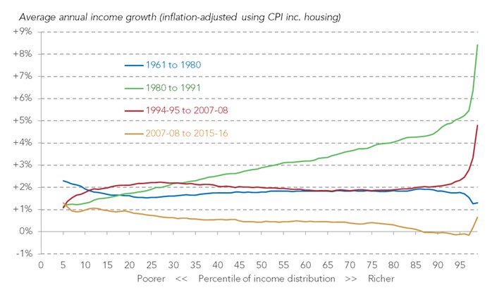
Now, wouldn’t it be interesting to see how the UK experience compares? We suspect it would be even more stark than in the US case.
UPDATE: well, it seems our wish has been granted. Thanks to the twittersphere and Torsten Bell, Director of the Resolution Foundation for this graph relating to the UK situation:
The UK economy in one chart 1) 80s boom for top half 2) before & after 80s 2% shared income growth was the norm 3) post-2008 = a disaster pic.twitter.com/SUGQMVtrB5
— Torsten Bell (@TorstenBell) August 8, 2017
Here’s that graph made larger:
The author

Related articles

Public finance is feminist terrain

She cleans your house but the tax system can’t see her
Joint submission: International financial architecture, debt and the right to education
20 May 2026

Taxing Ethiopian women for bleeding

Tax justice and the women who hold broken systems together
")
What Kwame Nkrumah knew about profit shifting
The last chance
2 February 2026

The tax justice stories that defined 2025

Let’s make Elon Musk the world’s richest man this Christmas!
")